"The SP for the Chinese Awaits Your Design--National iQue GBA SP Design Contest" has officially concluded on Christmas Eve after two whole months! This event accumulated 716 valid submissions, and had over 100,000 participants to vote for the best designs. This was also the first large-scale gamer activity in China's TV game industry, and had a even more special meaning for the Chinese gamers as they are so close to their dreams for the very first time.
Among these 700+ submissions emerged many wonderful and unique design ideas, and from the careful design and detailed descriptions of their work from each and every participating gamer, we could feel strongly the heartfelt love from Chinese gamers to the GBA SP consoles. Here, we would like to again thank for the enthusiastic participation from all gamers! Also, let's hear from the winners of the contest.
The following are the interviews with some of the Top 10s,
For more excellent submissions, please visit www.ique.com/news/zx_041109.htm
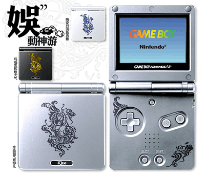
Submission #0375
Designer: Zhang Chonghui (张崇惠)
Submission Name: iQue Entertainment Vitality (娱动神游) (Grand Prize Winner)
Q: Why did you choose this theme?
A: I've considered a lot in the very beginning. Of course, I made my choice primarily by the contest rules--Chinese characteristics. After deciding on the overall theme, I began to wonder what kind of pattern I should choose. I thought that while China has many cultural heritage and beautiful patterns, few could truly relate to gaming. So I began to think: What could videogames bring us? Fights and kills? Daydreams? Excitements?...Actually, it's none of them. Videogames bring us the feeling of joy and pleasure, like a fish swimming in the water, Free! Happy! (I want to thank my pet fish Datou (大头) here)
So I chose the fish out of many themes. Also, I worked hard to draw their poses as lifelike as possible, so that gamers could feel my ideas when they see the patterns.
Q: What were your design ideas?
A: I just wanted to draw the fishes lifelike (which I still cannot)
The patterns are made up of two carps. The Chinese name for carp (鲤鱼) rhymes with "entertainment" (娱乐), and is itself a Chinese auspicious pattern of happiness. I wanted to design the fishes as different from the common ones, so I tweaked the characters for iQue (神游) in Seal Script slowly towards the form of fishes until the shape appeared. So this pattern isn't just two fishes, but a pattern symbolizing "iQue Entertainment". The shape on the top left corner is a wing, symbolizing "infinity".
This may be a Chinese style pattern, but I also wanted it to be a bit western as well, so I used an asymmetrical composition. This resulted in a pattern with Chinese characteristics but a novel composition. Next up was the overall harmony. A Chinese pattern by itself cannot represent anything, and putting the pattern stiffly on the game console doesn't fit the overall appearance. This was when I thought about the word "China", which means porcelain in lower case. This means that the porcelain of China are very famous, so designing the handheld as a blue and white pottery would bring a refreshing look. Thus, I chose a porcelain design: a blue pattern on top of a porcelain white case. This makes the design more appealing and more representative [of Chinese culture].
With such an iQue GBA SP in hand, your handheld would stand out as made in China even in the streets of a foreign country.
Q: Any difficulties or interesting events during the design process?
A: I don't think I encountered any difficulties.
As for interesting events, let's say I was very lazy, and I actually did not plan to attend at first. However, my boyfriend was bugging me everyday...he thought that the deadline was on [December] 10th and I only struggled to participate because he was driving me up the wall. In retrospect, though, I should give him the thanks.
Q: Looking at your submission now, are you satisifed with it? What are some room for improvement if you're not very satisfied?
A: In terms of satisfaction, it's half and half. If I were to choose again, I would still pick this theme, because it fits well with the contest rules... but the fishes though...they are not lifelike enough, which I've already mentioned previously, and I'm really bother by it. It must be because my drawing skills are not good enough, bummer...
Q: What job do you work?
A: It should be design...but I don't exactly have a goal right now. Most of the people working at my design company are boys, and heavy smokers too, since we have to stay up late and crunch! I can't stand smoking at all. Sigh...I hope I can find a design company where nobody smokes!
Q: How did you get to know design and how long have you been a designer?
A: I actually studied four years of oil painting, but I've been drawing comics since middle school, so I've been drawing for almost 10 years. I got a computer 2 years ago, and heck, that's when I got fascinated by Computer Graphics, got to know a lot of friends in the field, and started an era of passion in design and messing around. That was also when my enthusiasm overflowed and drew a graduation project on oil painting materials/design, and finally decided to work in the design industry after getting acclaims for the project. (I was actually already formally working at a design company in my junior year, while I was still at school...)
Q: Do you have your own iQue GBA SP? What games do you usually enjoy playing?
A: A shame, but I don't have one. I only have the original GBA, PlayStation 2, and PSONE. As for my favorite games, my recent favorite is Katamari Damacy, and I'm fascinated by dance arcades and all music games. Funny, no? My favorite GBA games are Golden Sun And Final Fantasy Tactics (I played the game for one year because I didn't want it to finish), and I'm currently playing Ace Attorney 3 and The Minish Cap. I still enjoy GBA games a lot.
A: What are some of the other submissions that you really appreciate?
A: Of course there are. My favorite is the #0118 [Crocodile] (鳄鱼) if the contest rules weren't a restriction. It has a very strong Nintendo style and I would definitely buy if it were released as a limited edition.
#0296 [iQue Wizard, Magical iQue] (神游法师,魔法神游) is also my favorite. I really wanted to learn vector art production from the creator. Has anyone checked out his other submissions? They are awesome!
#0508 [iQue "Auspicious Clouds in the Sky" SP] (神游"瑞云飞天"SP). The color choice is very good, and it would be even more attractive with a burlap pocket.
#0239 [Auspicious Fire Qilin] (瑞火麒麟) An original work with a lot of efforts devoted into. Please support it!
There are also many very creative submissions! Personally, I'm very supportive of any original work!
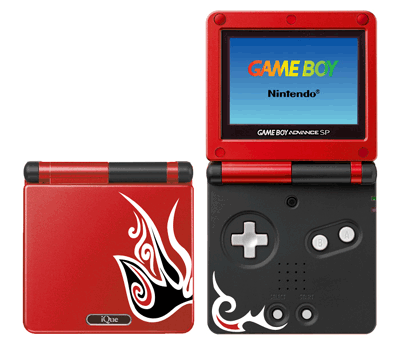
Submission #0370
Designer: Zhang Wenkai (张文凯)
Submission Name: Chinese Peking Opera Theme SP (中国京韵主题SP) (4th Place)
Q: Why did you choose this theme?
A: When I first learned about this contest from the magazine, I immediately began to brainstorm design based on Chinese classica themes, like paper cutting, Peking Opera, and New Year Pictures. In the end, I chose the Peking Opera because it is the cultural heritage of our nation. I hope the Chinese videogame industry, now in its infancy, will become our national pride like the Peking Opera, and become a form of art (as videogames are "the Ninth Form of Art").
Q: What were your design ideas?
A: Considering that slapping the full Peking Opera Facial Makeups on the GBA SP would no doubt look stiff and overly flashy, I decided to abstract the Facial Makeups into symbols, so they would still look like Peking Opera Facial Makeups at first glance but would also appear simple. In terms of color, I chose the colors commonly used on the Facial Makeups: the Chinese traditional colors of red, black, and white. Too many colors and the pattern would appear messy.
Q: Any difficulties or interesting events during the design process?
A: Of course there were. The difficulties mainly comes from how to design patters that are both simple and could instantly remind people of Peking Opera, and I drew a lot of drafts after doing a lot of research. It must have been very boring to do all of these alone, so I was fortunate to have a friends to help me brainstorm ideas and look up information. After some discussion we eventually decided on a finalized draft. It did not take a lot of time to finish making it in Photoshop, and in contrast, the brainstorming and discussion process with my friend was very interesting.
Q: Looking at your submission now, are you satisifed with it? What are some room for improvement if you're not very satisfied?
A: Now that I look at it, I'm not very satisfied. I think my composition did not take up enough space. The submission "iQue Entertainment" gave me some inspiration: It would have been more beautiful if I drew with finer stroke sand embedded a few more elements.
Q: How did you get to know design and how long have you been a designer?
A: I got to know design first as a college freshman, graphical design to be precise. I've been designing for almost 4 years now, and I started to use Photoshop because I wanted to make myself a forum avatar :) Ever since then, graphical design has become my major hobby. Later, I got to know 3D design (as required by my major), so learning 3D has become another hobby of mine.
Note: This block of text was exactly the same as the interview of the next participant in the source website, probably due to human error. It is unknown who this paragraph originally referred to as very few context was provided.
Q: Do you have your own iQue GBA SP? What games do you usually enjoy playing?
A: Not yet, huh. However, I do have a PlayStation 2. As for the games I like, the Zelda series, Final Fantasy series, Viewtiful Joe, Devil May Cry, Tales of series, Fatal Frame, etc... in short, I give all good games a try.
A: What are some of the other submissions that you really appreciate?
A: #0375 [iQue Entertainment Vitality] (娱动神游) It is really not easy to create a design of such charm.
#0239 [Auspicious Fire Qilin] (瑞火麒麟) A design with a lot of efforts put into it. It's a shame that it did not get the 2nd place.
#0286 [Earliest Civilization] (最早的文明) A design both simple and good-looking.
#0081 [Red Lotus] (红莲) Very nice work.
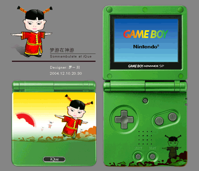
Submission #0434
Designer: Luo Yichuan (罗一川)
Submission Name: Somnambulate at iQue (梦游在神游) (7th place)
Q: Why did you choose this theme?
A: I knew this event from a design forum, in a post where the OP is a participant asking for votes. I think his submission was the "iQue Magician". So, I got to the iQue event page, where realized that iQue was a Nintendo company, which made me very excited! My first childhood game console was a Nintendo brand, which I only get from going on a hunger strike against my parents. As I recall, that game console was really fun, so I got the sudden idea of owning another Nintendo console--the GBA SP (so you know that I don't have one right now). That's how I got into the event!
Q: What was your design idea?
A: On the design process, first, I read the design requirements from iQue, as satisfying the requirements is the primary factor for a successful design. Next, I brainstormed for creative ideas. Videogames are like dreams to me, because most of the objects and events in game are virtual, and cannot be accomplished or satisfied in real life. This is a crucial factor why videogames will never lose their appeal. Combining this theme with iQue, I came up with a name for the design: Somnambulate at iQue.
Q: Any difficulties or interesting events during the design process?
A: When I was making the design, I thought about the craft of printing, as well as a very popular metal pencil case I had as a child. Everyone knows about the Watermelon Taro pencil case, don't they? So I designed using the most popular illustration technique, combined with traditional Chinese art, and created this Chinese doll, which I drew as clumsy on purpose. The art represents the paradise in our dreams, and the atmosphere of the entire design fits the theme "Somnambulate at iQue".
(A word of advice for those who are starting to learn design: Think before you draw, and don't aimlessly move your pen. A aimless design would appear jumbled together and carry no meaning or content)
I think the whole design process was rather smooth. One interesting trivia is that the gesture of this sleepwalking Chinese doll is actually a gesture my girlfriend often makes, so it would count as a cartoon figure of her, heh.
!
Q: Looking at your submission now, are you satisifed with it? What are some room for improvement if you're not very satisfied?
A: I still have some dissatisfaction with some parts, mainly some of the details. Since time was running short and the winners are deciede by votes (I never knew vote spams were a thing), so I submitted before I could make any fine tunes to the layout!
Q: What job do you work?
A: I majored in design and has worked as a designer for 3 years. I used to make design and advertisements, and now I work as an art designer at an IT company!
Q: How did you get to know design and how long have you been a designer?
A: I got to know design first as a college freshman, graphical design to be precise. I've been designing for almost 4 years now, and I started to use Photoshop because I wanted to make myself a forum avatar :) Ever since then, graphical design has become my major hobby. Later, I got to know 3D design (as required by my major), so learning 3D has become another hobby of mine.
Note: This block of text was exactly the same as the interview of the previous participant in the source website, probably due to human error. It is unknown who this paragraph originally referred to as very few context was provided.
A: What are some of the other submissions that you really appreciate?
A: I think it's a bit awkward to review some of the other submissions because many are not original, and may run into copyright issues, like #0550 which now ranks 3rd. Submission #0296 "iQue Wizard, Magical iQue" left a good impression on me, which I talked about earlier. Sadly, it doesn't comply with the design requirement that submissions need to display Chinese characteristics. I don't have much to say here, but I think it's already
great that so many people were eager to participate in this event!
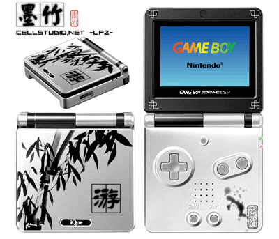
Submission #0020
Designer: Li Fangzhou (李方舟)
Submission Name: The Ink Bamboos (墨竹) (6th Place)
Q: Why did you choose this theme?
A: China has plenty of cultural heritage, but Ink wash paintings are my favorite. After all, I am just a novice art designer, and I also hope that young people nowadays do not forget their traditions. Besides, what is traditional does not have to be unfashionable, as the two could be perfectly merged together with some reasonable design and packaging. The "character" of the bamboos well displays the Chinese spirit: flexible and strong, and that's how I came up with the Ink Bamboo design.
Q: What was your design idea?
A: My design falls into 6 step:
1. First the bamboo on the front cover. I drew them using the pen tool in photoshop from my understanding of bamboos, which turned out well, so I sticked with it. However, some of the judges said I drew too many leaves. Actually, I envisioned the pattern as a corner of the bamboo forest, and one of my original intents was to create a harmony of the static and dynamic. If the design didn't reflect my intentions, then it just means I needed a little more work.
2. The character "游" (To swim/play/travel). Some said it was a good design, but others said it ruined the whole picture. To be fair, this was a design made for iQue, and the character has multiple meanings: To enjoy a life of games(游戏人生) with your GBA SP, to travel the world (游历四海) with your portable handheld, and representing the company iQue (神游) itself. Also, the square grid used in caligraphy could better display our Chinese heritage.
3. The four corners of the screen are decorated with traditional Chinese patterns. This may negatively affect the overall design, but at least it can serve as a reference for a design blueprint.
4. The inkplot below the buttons was designed to give an ethereal feel. To make the inkplot more realistic, I strengthened the gradient effect, so that it looks as if it were left accidentally after finishing the painting and writing on the front cover. Of course, this is just my own thoughts, and I have no comment on if others agree or not.
5. Next comes the stamp. If one cannot make out what word it is, it's actually "画奴" (Slave to the Graphics). What I was trying to say was, the graphics of the GBA SP [were so stunning] that people become [enchanted by and] enslaved by it. This would make it also count as a form of advertising, and I'm not just making a design.
6. Lastly, I made an [extra] 3D representation. Not really a very artistic addition, but simply shows the overall effect of combining ink black and white.
Q: Any difficulties or interesting events during the design process?
A: I am an art designer for CellStudio.Net, and I was working on the user interface for a game editor. My head was spinning when I finished the design, and I send the GBA SP design by accident. Our programmer got confused and thought I was making an emulator :)
Q: Looking at your submission now, are you satisifed with it? What are some room for improvement if you're not very satisfied?
A: Now that I see it...I'm not very satisfied. I could embellish the side of the screen with more traditional Chinese patterns, and the bamboo also has room for improvement. Most importantly, the design needs to be compatible with the GBA SP printing process.
Q: How did you get to know design and how long have you been a designer?
A: It started from highschool. I participated in a webpage design contest of my school, which ended in a total defeat, probably because my strength is primarily in computer software and hardware. In terms of design, I was limited to editing from templates.
I truly went into design around one year ago, when I got to know Chkey (programmer of CellStudio.Net). We cofounded CellStudio.Net out of mutual love for videogames. At the time we were its only members: I was the art designer and he the programmer. We built everything from scratch, and that includes the interface for all our software and website. My skills were honed as we finished one game editor after another. I'm very thankful of him, as he changed my life from ordinary, and liberated my entire mine. I constantly browsed excellent designs from foreign designers, and started from the initial surprise and exclamation, to the mimicking their work, and finally, to when I could final put my thoughts into ones and zeroes. It was a long and difficult time. I was not an art designer with professional training, but I am here now thanks to my inspiration from colors. It is a difficult path, but I will continue to strive foward.
Q: Do you have your own iQue GBA SP? What games do you usually enjoy playing?
A: I have my own Game Boy Advance. I enjoy a number of games: Golden Sun, Shining Soul, Gran Turismo, Sonic Team, Bomberman, Super Mario Bros. 3, Rainbow Six, V-Rally 3, and so on. My favorite game genre is Action RPG and my favorite game is Shining Soul.
A: What are some of the other submissions that you really appreciate?
A: #0370 [Chinese Peking Opera Theme SP] (中国京韵主题SP)
This was also one of my initial ideas. It has some flaws but is really strong in terms of originality.
#0041 [My] While it may not be of Chinese characteristics, it gives a good sense of vision, especially the wings. They are the symbols of Mario. If
虽然没有符合中国特色的要求,但是跟给人很好的视觉感,尤其是是那对翅膀,马力的代表性图案啊,如果说同样没有符合中国特色这一要求的。
#0375 [iQue Entertainment Life] (娱动神游) can rank first without having Chinese characteristic, I don't see why "My" did not get at least the top 8.
Note: We might be seeing a diverge of opinions here. Zhang, the designer for the Grand Prize, clearly stated that her design was made by the rules, while Li disagreeded it here.
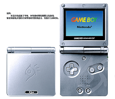
Submission #0286
Designer: Zhu Yukun (朱昱坤)
Submission Name: The Earliest Civilization (最早的文明) (10th Place)
Q: Why did you choose this theme?
A: When I first saw the requirements for the event, I figured that many would make their design with very traditional elements like dragon patterns, Chinese knots, or Chinese characters. I did not think that as the best course of action since these patterns are too common in designs, and many are rather similar in style. A frequently seen pattern would often reduce the visual impact. Plus, with the iQue SP being a fashion product, the design should fit with the simplicity style of the electronics industry. Therefore, I started from the pioneering significance of the Chinese iQue GBA SP console, and decided to create a design based on the totem during matriarchal clan era, the pioneers of Chinese civilization.
Q: What were your design ideas?
A: My line of thought was not complex and was clear from the start. It boils down to two points: 1. Simple, not complex, but special. 2. Carry a primeval feel of the totem, fitting the pioneering theme.
I first reflected on the totem drawings on pottery from the Banpo and Hemudu sites, illustrated in the history books, especially the patters from the painted pottery basin with fish and human face design. I started by making mutiple attempts from changing from these patterns, and finally decided on this one: a pattern resembling a fish, looks like the character for the sun in ancient writings, and also feels like the pendant of an ancient ornament. The 3 extra strokes were added to balance, and the design inside the handheld is just an enlarged segment of the icon. Suggestions are appreciated.
Q: Any difficulties or interesting events during the design process?
A: No difficulties, as it only took 2 cigarettes from conception to completion. However, I finished the design during work hours so I was rather nervous.
Q: Looking at your submission now, are you satisifed with it? What are some room for improvement if you're not very satisfied?
A: It looks okay, but the pattern could have been more exquisite and larger. I'm mainly satisfied with the embossed engraving effect, heh. Feels more comfortable when you touch it.
Q: What job do you work?
A: I am a graphic designer that also draws illustrations and comics part time. I am currently making animation for multimedia messages.
答:我是做平面设计的,兼画插画,漫画。现在做彩信动画。
Q: How did you get to know design and how long have you been a designer?
A: I was an art major and I studied design in college, though I took the art school test because I like drawing comics... I've been working as a designer since college for 2 years.
Q: Do you have your own iQue GBA SP? What games do you usually enjoy playing?
A: I do not have any handhelds, and I only have a PC. My dream is to own a PlayStation Portable and a PlayStation 2. I only play first person 3D action games and some interesting RPGs. Brain-racking simulation and puzzle games are my worst nightmare.
A: What are some of the other submissions that you really appreciate?
A: A lot of submissions are very interesting and their contents stand out, and they also have very special designs. I still like them even when they don't comply with the criteria due to various reason. However, since I was busy at work, I did not see all of them.
For instance, I really like the layout of the 1st place design;
submission #0370 by Zhang Wenkai (张文凯) has a good interaction between its patterns;
submission #0550 "Plum Bossom" (梅花) by Li Qing (李清) has a bold design. They all left a good impression on me.